This manual explains multiple approaches to add custom themes to the application. It also describes how to add and enable multiple themes for the ui.
Here are some quick links to the different chapters:
Modifying Available Themes
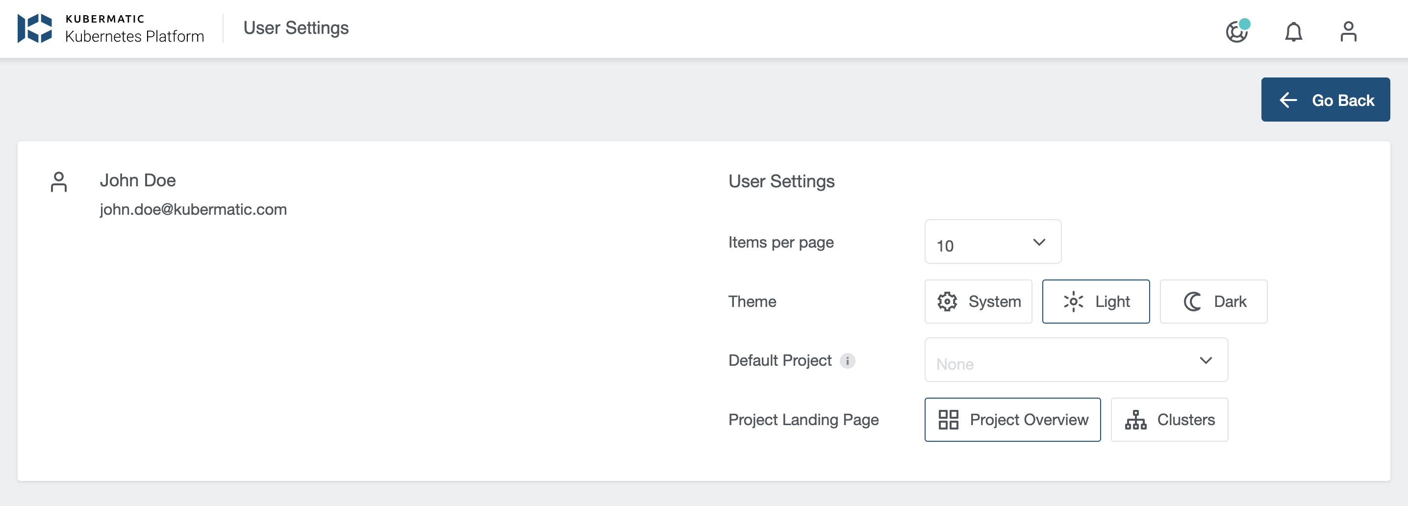
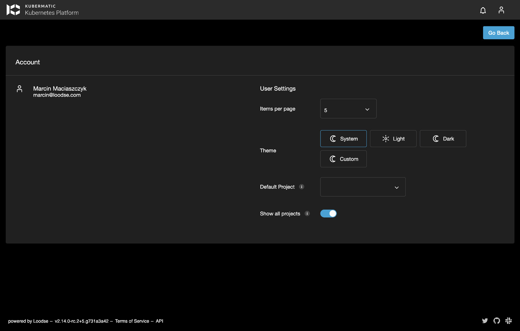
Currently, the application offers two themes by default, light and dark. There is also an option to choose system theme and let the application choose dark/light theme based
on the user’s operating system theme. Each user can specify a theme to use in the Account view which is accessible from the user menu under User Settings:

Disabling Theming Functionality
In order to disable theming options for all users and enforce using only the default theme, set
enforced_theme property in the application config.json file to the name of the theme that should be enforced (i.e. light).
Possible Customizing Approaches
There are two possible approaches of preparing custom themes. They all rely on the same functionality. It all depends on user access to the application code in order to prepare and quickly test the new theme before using it in the official deployment.
Preparing a New Theme With Access to the Sources
This approach gives user the possibility to reuse already defined code, work with scss instead of css
and quickly test your new theme before uploading it to the official deployment.
All available themes can be found inside src/assets/themes directory. Follow the below steps to prepare a new custom theme:
Create a new
scsstheme file insidesrc/assets/themesdirectory calledcustom.scss. This is only a temporary name that can be changed later.As a base reuse code from one of the default themes, either
light.scssordark.scss.Register a new style in
src/assets/config/config.jsonsimilar to how it’s done forlightanddarkthemes. As thenameusecustom.name- refers to the theme file name stored insideassets/themesdirectory.displayName- will be used by the theme picker available in theAccountview to display a new theme.isDark- defines the icon to be used by the theme picker (sun/moon).
{
  "openstack": {
    "wizard_use_default_user": false
  },
  "share_kubeconfig": false,
  "themes": [
    {
      "name": "custom",
      "displayName": "Custom",
      "isDark": false
    }
  ]
}
Run the application using
npm start, open theAccountview underUser settings, select your new theme and updatecustom.scssaccording to your needs. It is possible to override basically everything inside this theme file. In example if you want to change background color of amat-form-fielddo this:.mat-form-field { background-color: red; }TIP: As currently selected theme name is saved inside user settings, change it back to one of the default themes before uploading your theme to the official deployment.
Once your new theme is ready run
npm run build:themes. It should create adist-themesdirectory inside Kubermatic Kubernetes Platform (KKP) Dashboard directory with compiledcssfiles of all themes stored insidesrc/assets/themesdirectory. Now you can rename yourcustom.csstheme file to some other name, i.e.solar.css.

- Now, update the
config.jsonin KubermaticSettings CR used byKubermatic DashboardDeployment and register the new theme same as it was done earlier. Make sure thatnameentry corresponds to the name of your theme file (without thecsssuffix). - As the last step, mount your custom CSS theme file to the
dist/assets/themesdirectory. To do so, specifyextraVolumesandextraVolumeMountsin the KubermaticSettings CR. Make sure not to override whole directory as default themes are required by the application. - After application restart, theme picker should show your new theme.

Preparing a New Theme Without Access to the Sources
In this case the easiest way of preparing a new theme is to download one of the existing themes light/dark. This can be done in a few different ways. We’ll describe here two possible ways of downloading enabled themes.
Download Theme Using the Browser
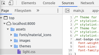
- Open KKP UI
- Open
Developer toolsand navigate toSourcestab. - There should be a CSS file of a currently selected theme available to be downloaded inside
assts/themesdirectory.

Download Themes Directly From the KKP Dashboard container
Assuming that you know how to exec into the container and copy resources from/to it, themes can be simply copied over to your machine
from the running KKP Dashboard container. They are stored inside the container in dist/assets/themes directory.
Kubernetes
Assuming that the KKP Dashboard pod name is kubermatic-dashboard-5b96d7f5df-mkmgh you can copy themes to your ${HOME}/themes directory using below command:
kubectl -n kubermatic cp kubermatic-dashboard-5b96d7f5df-mkmgh:/dist/assets/themes ~/themes
Docker
Assuming that the KKP Dashboard container name is kubermatic-dashboard you can copy themes to your ${HOME}/themes directory using below command:
docker cp kubermatic-dashboard:/dist/assets/themes/. ~/themes
Using Compiled Theme to Prepare a New Theme
Once you have a base theme file ready, we can use it to prepare a new theme. To easier understand the process, let’s
assume that we have downloaded a light.css file and will be preparing a new theme called solar.css.
Rename
light.csstosolar.css.Update
solar.cssfile according to your needs. Anything in the file can be changed or new rules can be added. In case you are changing colors, remember to update it in the whole file.Mount new
solar.cssfile todist/assets/themesdirectory inside the application container. Make sure not to override whole directory.Update
config.jsonfile insidedist/configdirectory and register the new theme.{ "openstack": { "wizard_use_default_user": false }, "share_kubeconfig": false, "themes": [ { "name": "solar", "displayName": "Solar", "isDark": true } ] }
That’s it. After restarting the application, theme picker in the Account view should show your new Solar theme.