This manual explains how to apply custom theme to the application. As we are using SCSS that needs to be processed into the CSS during the build, there are different approaches to it that will be described in the following sections.
Customizing the Application Sources
This is the most obvious approach to customizing the application. However, it requires access to the repository as some of the sources need modifications. Its biggest advantage is possibility to reuse rules that are already defined.
All the application-wide rules are stored inside src/assets/css directory, where _main.scss is the main file that
imports all other files that are required. The recommended approach to override application default styling is to
register custom CSS files inside _main.scss and override existing CSS files only if it is needed. Overriding existing
files is required when for example color variables need to be changed application-wide.
After applying all the required changes, a new container can be build and deployed into the cluster.
Tip: It is easier to avoid merge conflicts and maintain rules stored inside separate files that will be only imported inside the application sources.
Tip: The order of imports is important. It is better to keep customizations at the end of the file to make them more important than the default application style.
Example
Let’s override the default application theme and change the primary color to red and social link icons color to green.
First, we need to find out what changes are needed.
To change application primary color to red we need to modify _colors.scss:
$primary: red;

...
To change social link icons color to green we will add a custom theme file named custom.scss with the following
contents:
.km-footer-nav .km-social i {
  color: green;
}
To register this file we will need to import it in the _main.scss file:
...

// Load custom theme.
@import "custom";
Now, having all the changes prepared let’s build a container image and deploy it to the cluster.
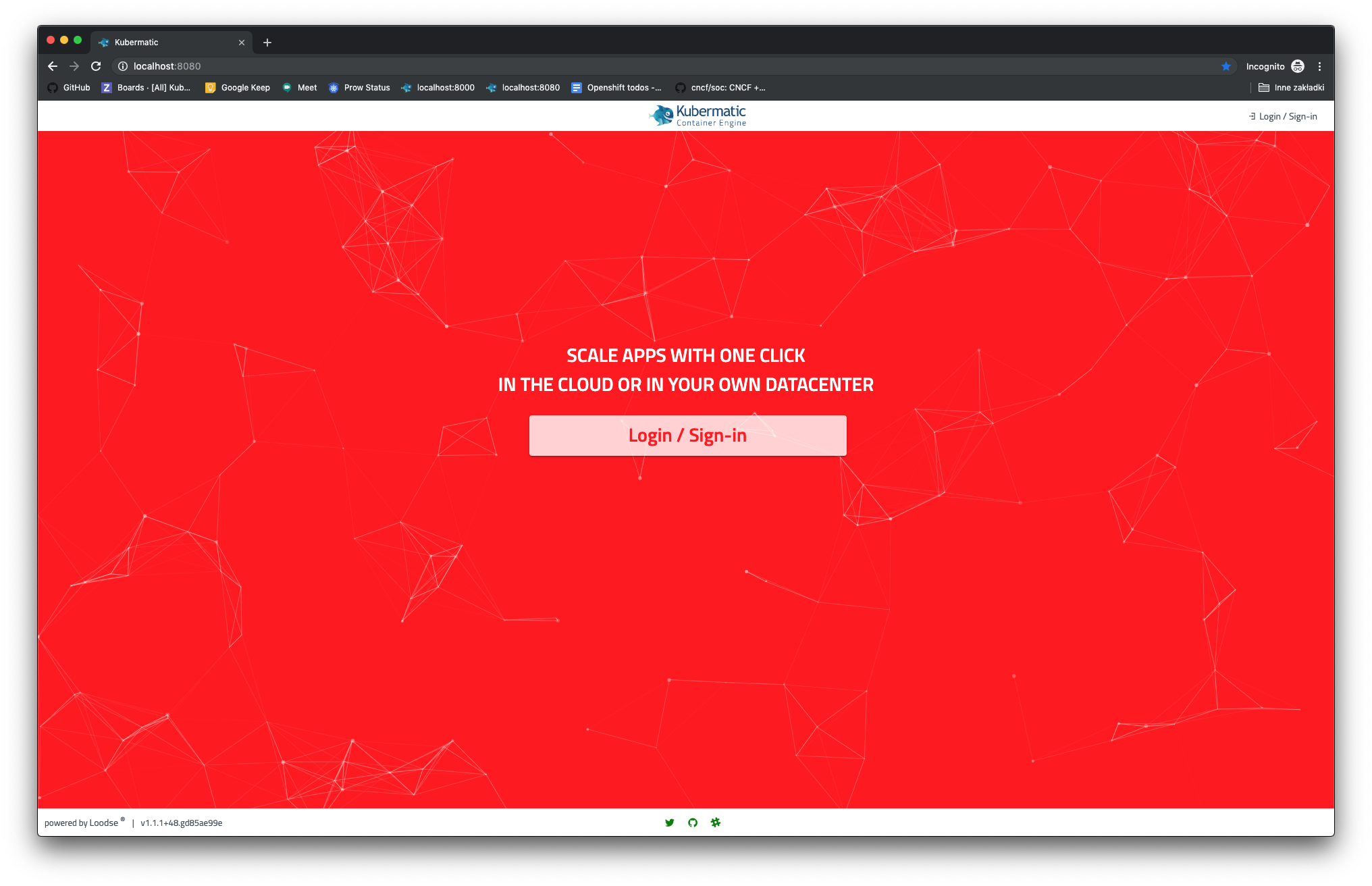
The result of this example should look like this:
Customizing the Application Sources Inside Custom Container
This approach is very similar to the first one, but this time application sources can be changed inside the custom container that was prepared specially for it. It allows to modify SCSS just like in the first approach, but files could be easily mounted into existing custom container, so there is no need to build another image.
Custom image is defined inside Dockerfile.custom and should be kept inside quay.io/kubermatic/ui-v2-custom
repository.
Customizing the Application Without Changing the Sources
This approach is recommended for those who cannot or do not want to modify application sources. It does not require access to the sources, as all customizations will be applied as CSS rules written from the scratch that will be mounted into the application container.
Custom CSS file needs to be mounted as specified in environment.prod.ts, so as dist/assets/custom/style.css.
Assuming that we have application image kubermatic/ui-v2:test that we want to customize and CSS file named c.css
we can run following command to start application and apply custom CSS rules:
docker run --rm -ti -v $(pwd)/c.css:/dist/assets/custom/style.css --user=$(id -u) -p 8080:8080 kubermatic/ui-v2:test
Tip: Custom CSS file can be used as a root file that will import other custom files.
Tip: Assets from an already running application can be viewed by accessing http://<host>>:<port>>/assets/<file>.
For example: http://localhost:8080/assets/custom/style.css.
Example
Like in the example to the first approach, let’s override the default application theme and change the primary color to red and social link icons color to green.
It is easiest to start with running the container with customizations file mounted to it:
docker run --rm -ti -v $(pwd)/c.css:/dist/assets/custom/style.css --user=$(id -u) -p 8080:8080 kubermatic/ui-v2:test
Then we can apply customizations to the $(pwd)/c.css file:
footer .km-footer-nav ul li a i {
  color: green;
}

div .km-frontpage-bg {
  background-color: red !important;
}

.mat-button-wrapper {
  color: red;
}
The result of this example should look exactly the same as in the example to the first approach.