The KKP Dashboard supports white-labeling through a branding configuration block and custom CSS themes. Branding configuration covers most customization needs (logo, colors, fonts, page title, etc.) without building from source. For deeper visual changes, custom SCSS/CSS themes are available.
Branding Configuration
Branding is configured via the KubermaticConfiguration CRD under spec.ui.config. Add a branding object to config.json:
apiVersion: kubermatic.k8c.io/v1
kind: KubermaticConfiguration
metadata:
  name: kubermatic
  namespace: kubermatic
spec:
  ui:
    config: |
      {
        "branding": {
          "product_name": "Chelsea Cloud",
          "product_url": "https://chelsea.cloud/",
          "postfix_page_title": "Chelsea Cloud",
          "tagline": "Your Cloud, Your Rules",
          "logo_url": "https://cdn.jsdelivr.net/gh/simple-icons/simple-icons/icons/kubernetes.svg",
          "logo_dark_url": "https://cdn.jsdelivr.net/gh/simple-icons/simple-icons/icons/kubernetes.svg",
          "favicon_url": "https://cdn.jsdelivr.net/gh/simple-icons/simple-icons/icons/kubernetes.svg",
          "background_url": "https://images.unsplash.com/photo-1451187580459-43490279c0fa?w=1920&q=80",
          "custom_css_url": "",
          "font_url": "https://fonts.googleapis.com/css2?family=Inter:wght@400;500;600;700&display=swap",
          "font_family": "'Inter', helvetica, arial, sans-serif",
          "hide_version": true,
          "hide_documentation_links": true,
          "colors": {
            "primary": "#0052cc",
            "secondary": "#00b8d9",
            "header_bg": "#1a1a2e",
            "header_text": "#ffffff"
          }
        }
      }
All fields are optional. Unset fields fall back to KKP defaults. Changes take effect after saving the CRD (no pod restart required).
URL fields like logo_url, favicon_url, background_url, and custom_css_url also accept relative file paths. If hosting assets on the internet is not possible, mount the files into the dashboard container and reference them by path (e.g. assets/branding/logo.svg). Use extraVolumes and extraVolumeMounts in the KubermaticConfiguration to mount the files.
Branding Field Reference
| Field | Type | Description |
|---|---|---|
product_name | string | Product name shown in sidebar and browser tab |
product_url | string | URL linked from the product name |
postfix_page_title | string | Appended to browser tab title |
tagline | string | Tagline shown on the front page |
logo_url | string | Logo URL (light theme) |
logo_dark_url | string | Logo URL (dark theme; falls back to logo_url) |
favicon_url | string | Custom favicon URL |
background_url | string | Background image URL for login/front page |
custom_css_url | string | URL to a custom CSS stylesheet for advanced overrides |
font_url | string | URL to an external font (e.g. Google Fonts CSS link) |
font_family | string | CSS font-family value applied globally |
hide_version | bool | Hide version info from the UI footer |
hide_documentation_links | bool | Hide all KKP documentation links from the UI |
colors | object | Color overrides (see below) |
Color Fields (branding.colors)
| Field | Type | Description |
|---|---|---|
primary | string | Primary brand color (hex, e.g. #1a73e8) |
secondary | string | Secondary/accent color (hex) |
header_bg | string | Header background color (hex) |
header_text | string | Header text color (hex) |
Custom Themes
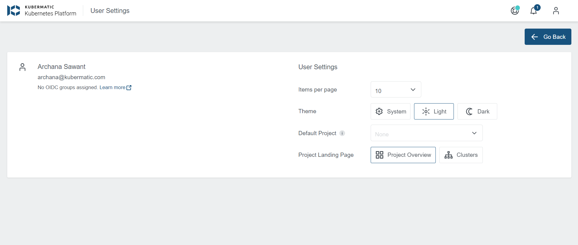
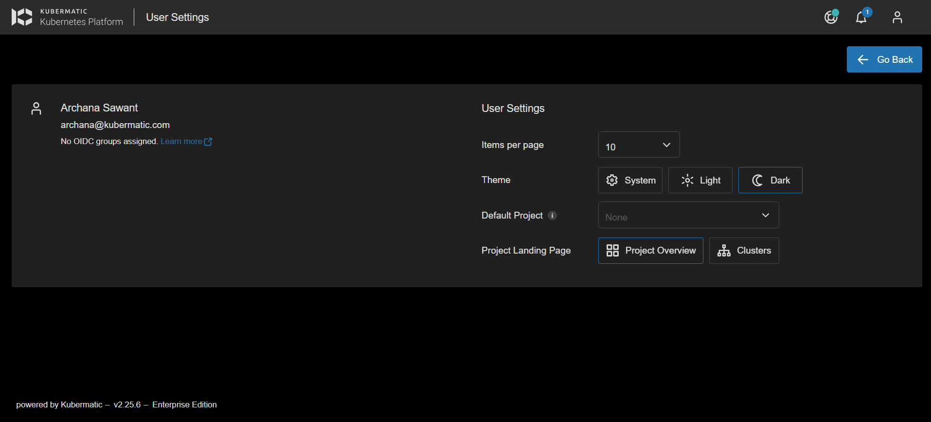
The dashboard ships with light and dark themes. Users select a theme in User Settings > Account:

Modifying Available Themes
Light, dark, and system (OS-based) themes are available by default. To force a single theme for all users, set enforced_theme in config.json to the desired theme name (e.g. light):
spec:
  ui:
    config: |
      {
        "enforced_theme": "light"
      }
Creating a Theme With Source Access
This approach uses SCSS and lets you test themes locally before deploying.
Create
src/assets/themes/custom.scssusinglight.scssordark.scssas a base.Register the theme in
src/assets/config/config.json:{ "themes": [ { "name": "custom", "displayName": "Custom", "isDark": false } ] }name— matches the SCSS filename (without extension) inassets/themes.displayName— label shown in the theme picker.isDark— controls the picker icon (sun/moon).
Run
npm start, switch to the new theme under User Settings, and iterate oncustom.scss. Any CSS rule can be overridden:.mat-form-field { background-color: red; }Switch back to a default theme before deploying, since the selected theme is stored in user settings.Run
npm run build:themes— this creates compiled CSS files indist-themes/. Renamecustom.cssto your final name (e.g.solar.css).

- Update
config.jsonin the KubermaticConfiguration to register the new theme (use the filename without.cssasname). - Mount the CSS file into
dist/assets/themesusingextraVolumesandextraVolumeMountsin the KubermaticConfiguration. Do not replace the entire directory — default themes are required. - Restart the dashboard pod. The new theme appears in the theme picker.

Creating a Theme Without Source Access
Download an existing compiled theme (light or dark) and modify the CSS directly.
Download via Browser
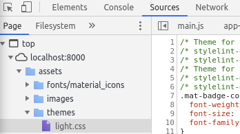
Open the KKP UI, go to Developer Tools > Sources, and download the active theme CSS from assets/themes.

Download from Container
Kubernetes
kubectl -n kubermatic cp kubermatic-dashboard-5b96d7f5df-mkmgh:/dist/assets/themes ~/themes
Docker
docker cp kubermatic-dashboard:/dist/assets/themes/. ~/themes
Using the Compiled Theme
Rename the downloaded file (e.g.
light.csstosolar.css).Edit
solar.cssas needed. Any CSS rule can be changed or added; if modifying colors, update all occurrences.Mount
solar.cssintodist/assets/themesin the dashboard container. Do not replace the entire directory.Register the theme in
config.json:{ "themes": [ { "name": "solar", "displayName": "Solar", "isDark": true } ] }Restart the dashboard. The new theme appears in the theme picker under User Settings > Account.