By default the dashboard renders a resource’s views directly from its OpenAPI schema: every field in schema order, nested objects as nested blocks. It is correct and always works, but for a large or deeply nested schema it is a wall of inputs with no grouping or hierarchy.
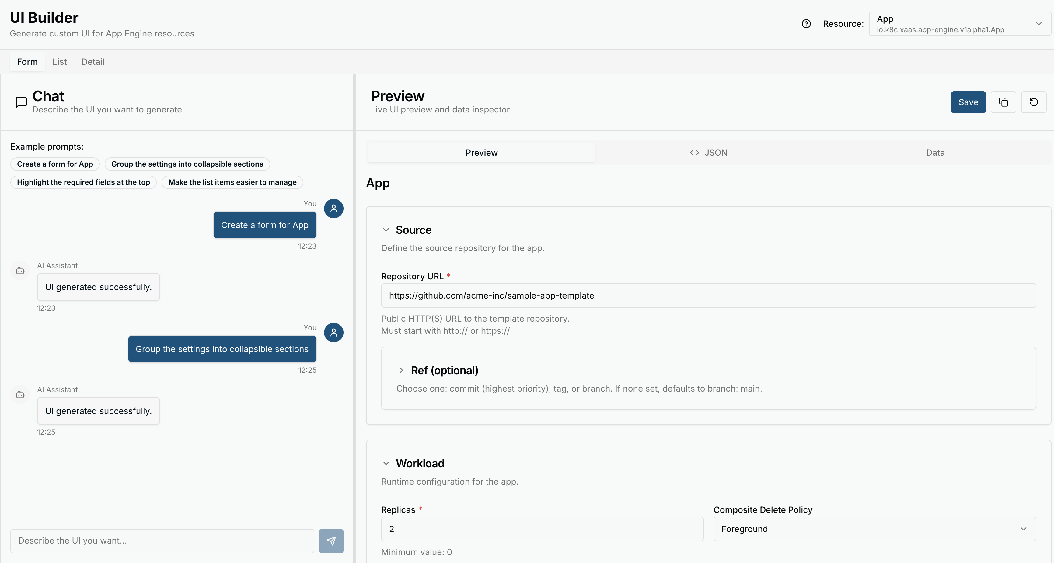
The UI Builder lets you design custom views for a service’s resources instead:
- The Form (create/edit) and Detail views are generated by the platform’s AI backend from a plain-language description.
- The List view is configured by choosing which properties to show — no AI involved.
This is presentation only. It changes how the dashboard lays out a resource’s views, not the resource’s schema or its validation. Submitted resources are always validated server-side against the real schema, and users can still switch to raw YAML at any time.
Defaults and per-workspace UIs
UI is per workspace. When a service provider builds a UI for a service’s resource, it becomes the default that every consumer workspace inherits. Any workspace can then build its own UI in the UI Builder — for the Form, Detail or List view — which overrides the default for that workspace only. Other workspaces keep the provider’s default until they build their own.
Using the UI Builder
From a service, open the UI Builder and:
- Pick the resource type (top-right) and the view you want to design — Form, Detail or List.
- For a Form or Detail view, describe what you want in the chat panel (“group the settings into collapsible sections”, “highlight the required fields at the top”), or start from one of the example prompts. For a List view, choose which properties to display.
- Watch the result in the live Preview; inspect the underlying JSON or the Data it binds to.
- Refine with follow-up messages until it looks right, then Save. The saved layout is what the dashboard renders for that resource in this workspace from then on.
Be specific about the fields and their types — the more precise the prompt, the closer the first result.
Automatic first draft
Set spec.generateUI: true on the Service you publish and KDP generates an initial Form and
Detail UI from the schema, so the Builder opens with something to refine rather than a blank
slate:
apiVersion: core.kdp.k8c.io/v1alpha1
kind: Service
metadata:
  name: certificate-management
spec:
  apiGroup: certificates.example.corp
  generateUI: true
  catalogMetadata:
    title: Certificate Management
    description: Acquire certificates signed by Example Corp's internal CA.
Generation is asynchronous; its state is reported on the Service through the UIGeneration
condition (Pending → Succeeded or Failed). With generateUI unset (the default) the
dashboard uses the direct schema-rendered form until a UI is built.
Keeping the UI in sync
An AI-generated UI is tied to the schema it was built against. When a resource’s schema changes, the dashboard flags the saved UI as outdated and shows a banner linking back to the UI Builder, where you can regenerate it against the new schema. Until then the resource keeps working on its existing UI.
Availability
The UI Builder is enabled by the operator on the dashboard deployment:
- The
ui-builder-enabledfeature flag (underdashboard.config.features.featureFlags) turns it on. It is on by default. - An OpenAI-compatible model must be configured for generation to work
(
api.config.openaiKeyandapi.config.openaiModel).
If the model is not configured, generateUI has no effect and services use the default
schema-rendered form. The same backend powers
AI-assisted Blueprint authoring.
Related topics
- Publishing Resources — where the
Serviceis defined. - Blueprints — composing services, including AI-assisted authoring.
- Consuming Services — the platform-user side.